Screen Size Checker — Detect Your Display & Calculate Screen Size
Instantly detect your screen resolution, viewport, and pixel ratio — plus a built-in diagonal-to-size calculator for converting width and height for any display.
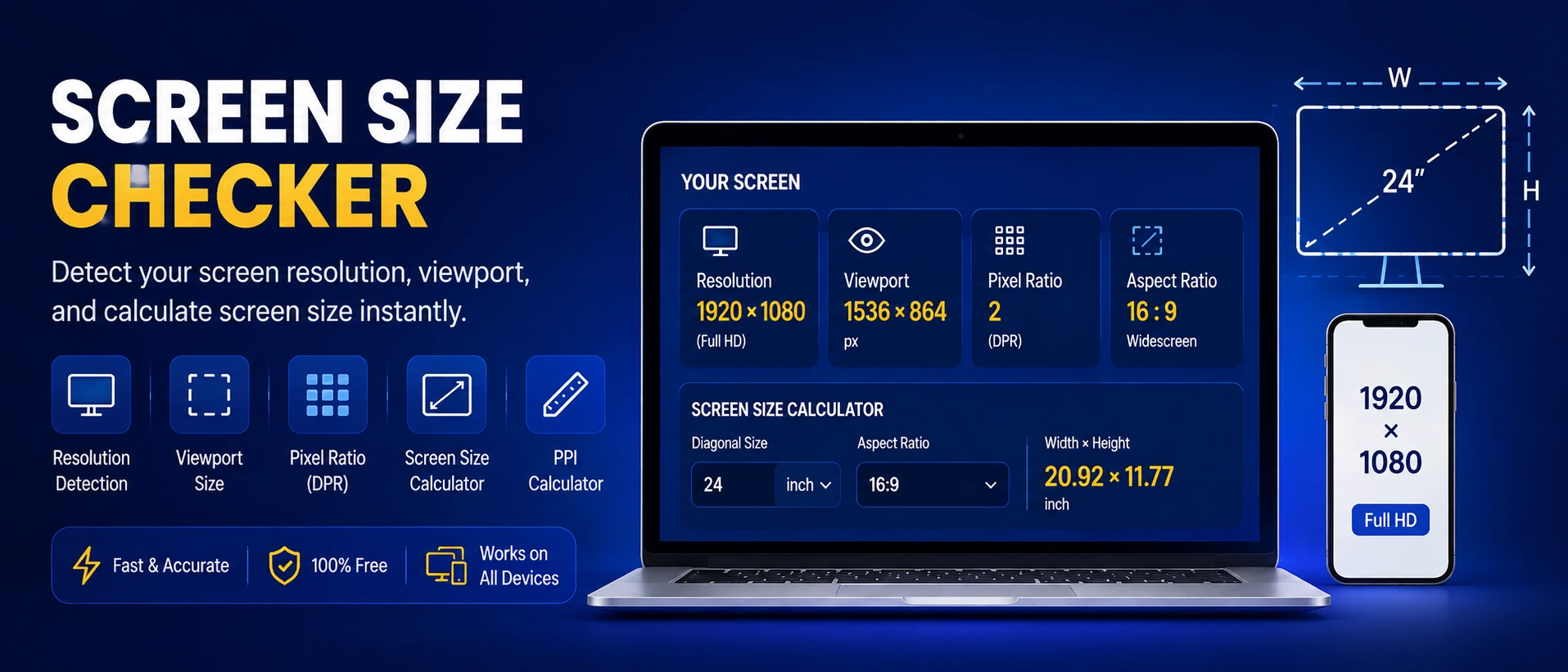
📱 Your Screen, Detected Live
These values are read directly from your browser the moment this page loads. Rotate your device or resize the window to see them update.
Everything above runs entirely in your browser — nothing is uploaded or stored on our servers.
📐 Screen Size Calculator — Diagonal, Width & Height
Know only one measurement? Enter the diagonal, width, or height of any screen along with its aspect ratio, and this tool instantly finds the other two dimensions plus the total area.
🔬 PPI (Pixels Per Inch) Calculator
Combine a screen's resolution with its diagonal size to find pixel density — useful for comparing display sharpness across monitors, phones, and TVs.
⚖️ Compare Two Screens Side-by-Side
Comparing devices before a purchase? This part of the screen size checker shows exactly how much bigger one screen is than another — enter each screen's diagonal and aspect ratio to compare physical size, area, and a true-to-scale visual.
Screen A
Screen B
🖥️ Dead Pixel & Screen Test
Fill your entire screen with a solid color to spot dead pixels, stuck pixels, or backlight bleed — common checks before buying a used monitor, TV, or phone, or after unboxing a new one. Tap any color, then tap or press Escape to exit.
Tip: a dead pixel stays black on every color; a stuck pixel shows a fixed red, green, or blue dot regardless of the color shown.
How This Tool Works
The detect panel reads standard, publicly-exposed JavaScript browser properties — screen.width, screen.height, window.innerWidth, window.innerHeight, and window.devicePixelRatio — the same APIs every modern browser provides for responsive web design. These pixel values are exact, not estimates.
Screen Resolution vs. Viewport — What's the Difference?
Screen resolution is the full pixel grid your display renders, regardless of what's on screen. Viewport size is only the visible content area inside your browser window — smaller once you subtract the address bar, bookmarks bar, or any open side panel. On a maximized browser window these can look similar; in split-screen or a resized window, they diverge noticeably.
The Diagonal-to-Width Formula
Physical screen dimensions follow the Pythagorean theorem, since diagonal, width, and height form a right triangle:
| Known Value | Formula |
|---|---|
| Diagonal → Width & Height | width = diagonal × W ÷ √(W² + H²), height = diagonal × H ÷ √(W² + H²) |
| Width → Diagonal | diagonal = width × √(W² + H²) ÷ W |
| Height → Diagonal | diagonal = height × √(W² + H²) ÷ H |
Here W and H are the aspect ratio numbers (e.g. 16 and 9). PPI is calculated separately as √(resolution width² + resolution height²) ÷ diagonal in inches.
Why Your Screen Resolution & Size Matter
Buying a monitor or TV: A retailer listing "27-inch" or "55-inch" is quoting the diagonal. The calculator above converts that into the actual width and height you need to check against your desk or wall space before ordering.
Web development and design: Knowing the exact viewport width your visitors use lets you pick sensible responsive breakpoints instead of guessing. The breakpoint indicator in the detect panel shows which common range your current window falls into, matching the conventions most CSS frameworks use.
Gaming and content creation: Matching in-game resolution to your monitor's native resolution avoids blurry upscaling. If your detected resolution doesn't match your monitor's advertised spec sheet, check your OS display-scaling setting first.
Video calls and screen sharing: A mismatched aspect ratio between what you share and what viewers see causes black bars or cropped content. Checking your live resolution before a call avoids that surprise.
Retina, HiDPI, and Why "1x" Isn't the Full Picture
A device pixel ratio (DPR) above 1 means the operating system is rendering extra physical pixels per CSS pixel for sharper text and images — Apple calls this "Retina," Android and Windows call it "HiDPI" scaling. A MacBook reporting a 1512×982 viewport at DPR 2 is actually driving a 3024×1964 physical panel. This is why the detect panel above shows both the browser-reported resolution and an estimated physical resolution — they can differ significantly on modern high-density displays.
Worked Examples
Common Screen Resolutions Reference
| Name | Resolution | Aspect Ratio |
|---|---|---|
| HD Ready | 1280×720 | 16:9 |
| Full HD (FHD) | 1920×1080 | 16:9 |
| WUXGA | 1920×1200 | 16:10 |
| QHD / 2K | 2560×1440 | 16:9 |
| UWQHD Ultrawide | 3440×1440 | 21:9 |
| 4K Ultra HD | 3840×2160 | 16:9 |
| 8K UHD | 7680×4320 | 16:9 |
Typical Diagonal Size by Device Type
Exact model specs change every year, so use this as a general starting range rather than a fixed number — for an exact figure, use the calculator above with your device's known diagonal and aspect ratio.
| Device Type | Typical Diagonal Range | Common Aspect Ratio |
|---|---|---|
| Smartphones | 6.1" – 6.9" | 19.5:9 / 20:9 |
| Tablets | 8" – 13" | 4:3 / 3:2 |
| Laptops | 13" – 17" | 16:9 / 16:10 |
| Desktop Monitors | 21" – 34" | 16:9 / 21:9 (ultrawide) |
| Televisions | 32" – 85"+ | 16:9 |
| Projector Screens | 80" – 150"+ | 16:9 / 2.39:1 |